Posted by
Dan
at
10:34 PM
| Name of Model: Corner Bank | | Created by: Dave Sterling | | Found at: http://www.mocpages.com/moc.php/62667 and http://news.lugnet.com/announce/moc/?n=4238 | Details:
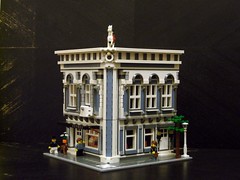
 The links above do a very good job of explaining this building's background and even providing entertaining commentary - so I'll stick to discussing the building techniques. Café Corner The links above do a very good job of explaining this building's background and even providing entertaining commentary - so I'll stick to discussing the building techniques. Café Corner fans have much to enjoy here - the perfectly-matching proportions are the first thing to stick out. It looks like those floors could be directly swapped out for the ones in the Cafe Corner. fans have much to enjoy here - the perfectly-matching proportions are the first thing to stick out. It looks like those floors could be directly swapped out for the ones in the Cafe Corner.
On the first floor, the terrace makes great use of tan, dark tan and dark red tiles to give the grounds a distinctive look. I love the use of official stickers for the studs-not-on-top sign over the door. If you've ever tried building in this style, you know how it easy it us to run out of windows, so the method used for stretching them out here is worth noting - Green Grocer wall segments are put in the middle, and the windows themselves are at a half-stud offset from the rest of the wall. I agree with the builder about that helping to capture the Gothic look. Finally, the row on the top makes use of 1x1 studs-not-on-top headlight bricks to make a row of plates face outward. My first reaction was that this must take a ridiculously large amount of parts. However, if you look more closely, you can see that there are actually four 1x4 plates and one 1x3 plate on each side - and those only have the headlight bricks on each end. I've always hesitated to try this because of the gaps it can cause, but I think that using this technique at equal intervals and with black bricks behind them actually makes a great effect here. wall segments are put in the middle, and the windows themselves are at a half-stud offset from the rest of the wall. I agree with the builder about that helping to capture the Gothic look. Finally, the row on the top makes use of 1x1 studs-not-on-top headlight bricks to make a row of plates face outward. My first reaction was that this must take a ridiculously large amount of parts. However, if you look more closely, you can see that there are actually four 1x4 plates and one 1x3 plate on each side - and those only have the headlight bricks on each end. I've always hesitated to try this because of the gaps it can cause, but I think that using this technique at equal intervals and with black bricks behind them actually makes a great effect here.
The second floor has more of the same excellent techniques - offset windows, CC- and GG- styled wall sections, and studs-not-on-top detailing. The wheels in particular were hard to figure out - note how there are no visible Technic pins there. I believe that the wheels have been attached to round 1x1-plates that are connected to large studs-not-on-top brackets (by placing the round plate in between the studs on the bracket). The decorative elements on the angled portion are great, too - I generally think of the bars as a fence piece, but that really works here. On the top of the second floor, I'm loving the railing - the technique is nothing new, but it's more widely used on trains than on town buildings.
Don't ask me what's under the windows on the third floor - I'm still not sure what I'm seeing there (I'd love higher-res photos, but I'd take a good explanation for what that part is too - for now I'm guessing that they're some sort of hinge part). The window offset is a bit deeper, but it works pretty well. I think that using angled parts instead of angling parts was a wise choice for the front corner - not to mention a good excuse to use an odd space part in a town building. The Basic 3+ windows might just be my favorite feature, though - they're pulled off here just as well as they are in the Cafe Corner, and the slope bricks used here are much more readily available then those wheel-well elements are. The roof line is classy and very similar to the Cafe Corner, but there are some new details there too (and of course, they're all excellent).
Long story short: my kind of town building. Of course, if you're really into crazy town techniques and working Technic and Space elements into "normal" buildings, it's worth taking a look at my DGXPO photos where you can see a few crazy ideas I've tried out but not blogged about yet. I love seeing these sorts of techniques, because it requires a good deal of cleverness and imagination, and also gives an explanation of why various bizarre LEGO® sets are worth buying. My parents are always asking me why I buy some of these things, but they're usually impressed when they see how many bizarre parts can be used in fairly "normal" contexts. Of course, that's a topic for another day... |
|
Posted by
Dan
at
12:25 AM
| Name of Model: Hermes Store |
| Created by: Jared Chan |
| Found at: http://www.flickr.com/photos/jaredchan/sets/72157623685539880/ |
Details:
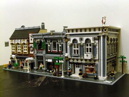
 At one point, there was a rumor that the next Cafe Corner style set would be sand blue. It's a shame that we didn't get a new kit in that color, but this model would be hard to top even if Jamie Berard (the designer of Cafe Corner, Green Grocer, and Grand Emporium) did pursue that color in an official set. While this whole model is fantastic, some highlights include the horse statue, the clothing racks, and the stunning architecture. The corner in particular is an interesting trick - instead of putting a full edge on the building with an angled doorway and windows, we get a column that just rounds things off. At one point, there was a rumor that the next Cafe Corner style set would be sand blue. It's a shame that we didn't get a new kit in that color, but this model would be hard to top even if Jamie Berard (the designer of Cafe Corner, Green Grocer, and Grand Emporium) did pursue that color in an official set. While this whole model is fantastic, some highlights include the horse statue, the clothing racks, and the stunning architecture. The corner in particular is an interesting trick - instead of putting a full edge on the building with an angled doorway and windows, we get a column that just rounds things off. I'm pretty sure the texture there is achieved by use of click hinge bricks facing opposite directions. Corrected by a reader Wednesday morning: This effect is built sideways in two different directions - those tiles are actually attached to 1x2 slopes, and we're seeing the sloped surface face outward. A clever and very easy solution!
This is just one part of a full street created by this one builder. You can see photos of all his modular buildings on flickr. |
|
Posted by
Dan
at
9:20 PM
| Name of Model: Ancient Lady's Museum |
| Created by: marcosbessa |
| Found at: http://www.flickr.com/photos/45092539@N02/sets/72157624545840324/with/4812544383/ & the same photos can also be found on Brickshelf: http://www.brickshelf.com/cgi-bin/gallery.cgi?f=438981 |
Details: 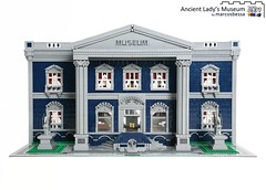 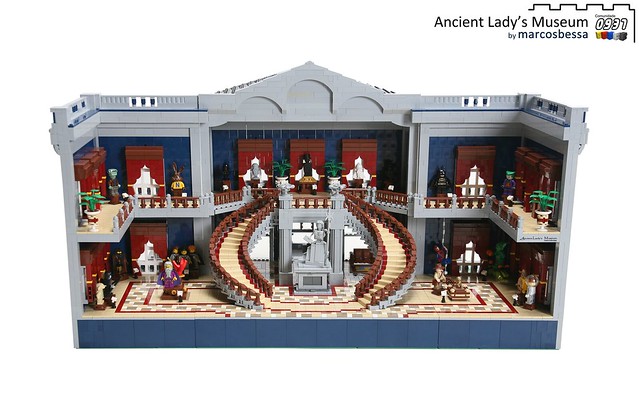 Premiered at this year's Arte em Peças event, this gorgeous show-stopper is actually in scale with the Cafe Corner and ready for minifigures. It's not truly to the Cafe Corner standard, though, since the back is wide open. Of course, if the back wasn't open, we wouldn't be able to see the fantastic interior work. Highlights include leathery couches, mosaic floor patterns, a pair of grand spiral staircases, a variety of minifigures on display, detailed curtains built upside-down (in dark red!), and ornate window decorations on the outside. You'll need to use the "View All Sizes" feature on flickr to zoom in and see the original photo size in order to see some of the details. Premiered at this year's Arte em Peças event, this gorgeous show-stopper is actually in scale with the Cafe Corner and ready for minifigures. It's not truly to the Cafe Corner standard, though, since the back is wide open. Of course, if the back wasn't open, we wouldn't be able to see the fantastic interior work. Highlights include leathery couches, mosaic floor patterns, a pair of grand spiral staircases, a variety of minifigures on display, detailed curtains built upside-down (in dark red!), and ornate window decorations on the outside. You'll need to use the "View All Sizes" feature on flickr to zoom in and see the original photo size in order to see some of the details.
You can also see a set of Work-In-Progress (WIP) photos of this model on flickr. One of the highlights is a look inside the column technique.
Additionally, the builder is now selling instructions for LEGO Digital Designer for another model I've featured from him:

|
| This is Saturday's model of the day |
|
Posted by
Dan
at
11:09 PM
| Name of Model: Modulex Modular Buildings |
| Created by: Brixe63 |
| Found at: http://www.flickr.com/photos/35385165@N05/sets/72157621787448381/ |
Details:
 I know I've blogged many models based on the Cafe Corner kit before (I'm also a contributor at Brick Town Talk, where we've previously featured today's models). These are different because they're actually really small - just 5/8ths the size of standard LEGO bricks. They are built with Modulex bricks, which the LEGO company manufactured for use in architectural models (they were not sold in venues where LEGO bricks are generally available). Building with Modulex is an interesting challenge - the part selection is radically different from what's available with standard parts, and even the colors aren't standard LEGO colors (although some of them are quite similar). In spite of all that, Brixe63 was able to successfully render these two popular LEGO kits (Market Street and Cafe Corner, both recently discontinued) in Modulex form. I know I've blogged many models based on the Cafe Corner kit before (I'm also a contributor at Brick Town Talk, where we've previously featured today's models). These are different because they're actually really small - just 5/8ths the size of standard LEGO bricks. They are built with Modulex bricks, which the LEGO company manufactured for use in architectural models (they were not sold in venues where LEGO bricks are generally available). Building with Modulex is an interesting challenge - the part selection is radically different from what's available with standard parts, and even the colors aren't standard LEGO colors (although some of them are quite similar). In spite of all that, Brixe63 was able to successfully render these two popular LEGO kits (Market Street and Cafe Corner, both recently discontinued) in Modulex form. |
|
Posted by
Dan
at
4:00 AM
| Name of Model: Buildings following the Cafe Corner modular standard | | Created by: Aliencat | | Found at: http://www.brickshelf.com/cgi-bin/gallery.cgi?f=341894 | Details:
 A BrickShelf user by the name of Aliencat has built a variety of excellent Café Corner-style models recently. The techniques are very interesting - many bits are adapted from the sets in that series, and others are new and quite clever. The brilliant use of color stands out right away - The Town Hall is the best mix of dark grey and dark stone that I've ever seen, and I never would have thought to use dark red or sand green that way either - and nearly all of these models get quite far with rare new colors. If you follow Brick Town Talk, you've already seen this builder's town/castle hybrid layout before too (and that's a great layout too). A BrickShelf user by the name of Aliencat has built a variety of excellent Café Corner-style models recently. The techniques are very interesting - many bits are adapted from the sets in that series, and others are new and quite clever. The brilliant use of color stands out right away - The Town Hall is the best mix of dark grey and dark stone that I've ever seen, and I never would have thought to use dark red or sand green that way either - and nearly all of these models get quite far with rare new colors. If you follow Brick Town Talk, you've already seen this builder's town/castle hybrid layout before too (and that's a great layout too).
Be warned, there are quite a few great photos here - with this site's old format, this would have been a Sunday post (I figure we should come back with a bang, though, since this is the first post after a lengthy break). |
|
Posted by
Dan
at
11:46 PM
| Name of Model: 10182 Space Cafe Roll | | Created by: mashikuf | | Found at: http://www.brickshelf.com/cgi-bin/gallery.cgi?f=293891 | Details:
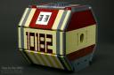 This is one you really have to look at to believe. It's a combination of a roll-bin, a space station, and the Cafe Corner set This is one you really have to look at to believe. It's a combination of a roll-bin, a space station, and the Cafe Corner set . We've previously featured the set and some models inspired by it, but this is the most original twist I've ever seen on the concept (I ought to clarify - when I first blogged about the set, Amazon had a bargain price for it, but they're currently selling it for about $60 more than the LEGO store is). The rounded sides of this model unfold out, and then you can see the colors of the set mixed with a variety of Space theme parts. The door with the Exploriens half-cylinder really stands out, but there are tons of great details here. . We've previously featured the set and some models inspired by it, but this is the most original twist I've ever seen on the concept (I ought to clarify - when I first blogged about the set, Amazon had a bargain price for it, but they're currently selling it for about $60 more than the LEGO store is). The rounded sides of this model unfold out, and then you can see the colors of the set mixed with a variety of Space theme parts. The door with the Exploriens half-cylinder really stands out, but there are tons of great details here. |
|
Posted by
Dan
at
11:34 PM
| Name of Model: Lego: Fancy Bookstore |
| Created by: cimddwc |
| Found at: http://www.flickr.com/photos/24588874@N08/sets/72157624132729033/with/5038875332/ |
Details:
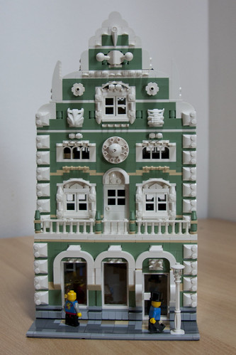 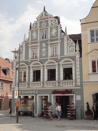
Usually, when I see a model inspired by the Cafe Corner set or following the modular build standard established by that kit, I write about it at Brick Town Talk instead of here (if it hasn't been blogged there already). As I was prepping a post about this model for BTT earlier, more details started to stick out to me - enough to make me realize I should feature it here as well. While this isn't quite a reproduction of the original building that inspired it (shown above right), this conjures up all the right details from the original and fits it into a layout-ready 24 studs (sure, 16- and 32-stud measurements are more common, but it's easy to fit in any multiple of 8 studs as a building width). The gargoyle-esque bits on either side of the top window are Bionicle krana in white. I don't believe we've ever seen them used in a model for minifigs before. Above that same window, we also see a ball joint element and a tooth with axle hole used as architectural details. Spires are made from 1x6 curved slopes, and border detailing makes use of many 2 x 2 curved slope pieces. All those clever bits come in before you even get to the gorgeous detailing at the windows!
|
|
Posted by
Dan
at
11:46 PM
| Name of Model: Weasleys' Wizarding Wheezes |
| Created by: Joel.Baker |
| Found at: http://www.flickr.com/photos/joel_baker/sets/72157625701256635/with/5356656246/ |
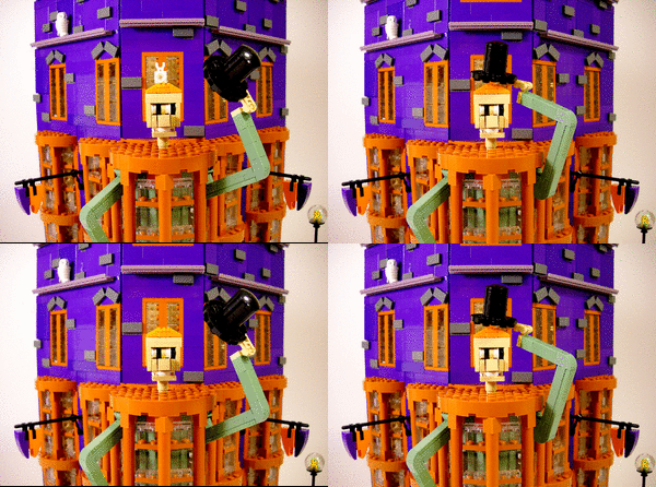
Details:  This model (not related to the great recent set) is based on Diagon Alley from the Harry Potter books This model (not related to the great recent set) is based on Diagon Alley from the Harry Potter books (more specifically, it's Weasleys' Wizard Wheezes). Just to kick things up a notch from the open-back nature of the Harry Potter kits, this rendition actually conforms to the Cafe Corner standard. The bold, rare colors are the first thing to catch your eye, but they're not even the most outrageous over-the-top feature - that would have to be the tipping of that hat. (more specifically, it's Weasleys' Wizard Wheezes). Just to kick things up a notch from the open-back nature of the Harry Potter kits, this rendition actually conforms to the Cafe Corner standard. The bold, rare colors are the first thing to catch your eye, but they're not even the most outrageous over-the-top feature - that would have to be the tipping of that hat.
The cleverly brick-built windows and the sidewalk mosaic make this stand out even more. Those great round dark orange protruded windows are also accurate to the version in the movies.
Oh, and about those rare colors - guess who figured out how much further you can go with them when you use DUPLO? This underused technique was able to keep the part count here unusually low - exactly 1,000 pieces were used. |
|
Posted by
Dan
at
1:22 AM
| Name of Model: Burberry™ store |
| Created by: Jared Chan |
| Found at: http://www.flickr.com/photos/jaredchan/sets/72157624216703327/ |
Details: 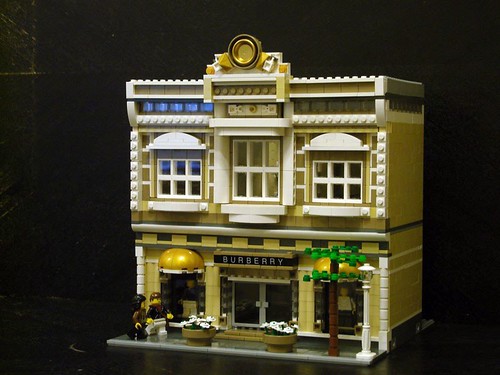 Recently featured on Brick Town Talk (which you should be reading in addition to this blog anyway), this Burberry store stands out as a high-water mark amongst recent highlights in the Cafe Corner standard of modular building (I post those highlights over at Brick Town Talk instead of here at LMOTD, but I did feature another model by the same builder this past March). Some of my favorite bits here: The Grand Emporium's awning technique recast in gold using parts from the Battle of Alamut, the use of a wheel and a dish for a unique gold-ish flourish at the top, and a group of bracket-plate-tile testures on the second floor (this actually adds up to the width of a normal brick and gives you that vertical stripe effect). I'm also a big fan of the studs that face toward the front of the building - the added texture looks great, and it's a feature that tile-crazed LEGO fans tend to forget actually looks pretty good in many contexts. Recently featured on Brick Town Talk (which you should be reading in addition to this blog anyway), this Burberry store stands out as a high-water mark amongst recent highlights in the Cafe Corner standard of modular building (I post those highlights over at Brick Town Talk instead of here at LMOTD, but I did feature another model by the same builder this past March). Some of my favorite bits here: The Grand Emporium's awning technique recast in gold using parts from the Battle of Alamut, the use of a wheel and a dish for a unique gold-ish flourish at the top, and a group of bracket-plate-tile testures on the second floor (this actually adds up to the width of a normal brick and gives you that vertical stripe effect). I'm also a big fan of the studs that face toward the front of the building - the added texture looks great, and it's a feature that tile-crazed LEGO fans tend to forget actually looks pretty good in many contexts. |
|
Posted by
Dan
at
2:34 PM
 Official information about the new Grand Emporium kit (which had briefly appeared on the Shop at Home website without any real announcement last week) has been scarce. International prices are still hard to pin down, and we still have no idea when the official release dates are. Strangely, though, in spite of the lack of information or fanfare (don't they know how excited we are about this kit?) the kit has surfaced for sale at LEGO Brand Retail locations in the UK. Brick Street over at Brick Town Talk was able to buy the kit at the Milton Keynes location for £139.99. He's been building the kit and reviewing it online as he builds it. There are tons of interesting details just in the box art he posted, and the pictures of the set's insides are even better! My search for 10211 (the Grand Emporium's set number) seems to be the best way to pull up all of the review posts at once. Official information about the new Grand Emporium kit (which had briefly appeared on the Shop at Home website without any real announcement last week) has been scarce. International prices are still hard to pin down, and we still have no idea when the official release dates are. Strangely, though, in spite of the lack of information or fanfare (don't they know how excited we are about this kit?) the kit has surfaced for sale at LEGO Brand Retail locations in the UK. Brick Street over at Brick Town Talk was able to buy the kit at the Milton Keynes location for £139.99. He's been building the kit and reviewing it online as he builds it. There are tons of interesting details just in the box art he posted, and the pictures of the set's insides are even better! My search for 10211 (the Grand Emporium's set number) seems to be the best way to pull up all of the review posts at once.
I can't wait to get my hands on this one for myself - it looks like a fitting replacement for the original Cafe Corner kit (this is now the only corner building available from LEGO in this scale). The few official photos that were available briefly earlier this week can now be found at Brickset. With any luck, LEGO will give this the official big announcement it deserves soon. |
|
Posted by
Dan
at
1:17 PM
| Name of Model: Town Hall built in 2 weeks for 1000steine event August 24th - 26th, 2007 | Created by: LEGO® designer Jamie Berard
Blog:http://sideshowjamie.livejournal.com/ Brickshelf: http://www.brickshelf.com/cgi-bin/gallery.cgi?m=SideShowJamie | | Found at: http://www.brickshelf.com/cgi-bin/gallery.cgi?f=272790 | Details:
 I've been thrilled to see over the past few months how much involvement LEGO® designer Jamie Berard has had with fans. He has become famous recently for designing popular sets like the Café Corner, but he also has made numerous appearances at events and been interviewed by a number of publications. Today's model is a town hall that is compatible with the Cafe Corner modular building standard. It was built over two weeks in 2007. Of course, some of the details point out advantages of working for the company - check out the windows made from hard-to-find garage door components. Also visible in that photo are some studs-not-on-top details using both bricks and a large amount of the 1x1 cheese slope pieces - and if you take a close look at the window frame, you'll notice that that's mostly done with studs facing outward instead of upward too. Other techniques, though, explain why they don't make sets like this. For one thing, there's the use of transition brown colors to get a realistic wood tone on the outside of the building (in 2003, the LEGO® company decided to change the color brown from the traditional shade to a new shade called "red-brown" or reddish brown. The newer color is molded in a different way that took a while to perfect - and in the interests of keeping costs down, LEGO decided to release thousands of brown pieces with small differences in shading. Some people are upset about this for obvious reasons, but using these pieces together with the older brown pieces and the final version of the new red-brown color does give a nice wooden effect). For another, this is enormous (15 inch / 48 stud square baseplate) and would be cost prohibitive. The columns are an excellent touch, and don't miss the gargoyle (an owl and a pair of biscuits in front of two wheel wells) or the bell (a "Mayan" coin, 1x2 tiles, and inverted 2x2 dish, some black studs-not-on-top pieces and two black rounded elements) either. My personal favorite technique, though, has to be the trick for the second-floor balcony overlooking the meeting room. It looks like a few tiles are extending the floor outward a little bit, and two of the round fence piece's post are latched onto by space robot arms. I've been thrilled to see over the past few months how much involvement LEGO® designer Jamie Berard has had with fans. He has become famous recently for designing popular sets like the Café Corner, but he also has made numerous appearances at events and been interviewed by a number of publications. Today's model is a town hall that is compatible with the Cafe Corner modular building standard. It was built over two weeks in 2007. Of course, some of the details point out advantages of working for the company - check out the windows made from hard-to-find garage door components. Also visible in that photo are some studs-not-on-top details using both bricks and a large amount of the 1x1 cheese slope pieces - and if you take a close look at the window frame, you'll notice that that's mostly done with studs facing outward instead of upward too. Other techniques, though, explain why they don't make sets like this. For one thing, there's the use of transition brown colors to get a realistic wood tone on the outside of the building (in 2003, the LEGO® company decided to change the color brown from the traditional shade to a new shade called "red-brown" or reddish brown. The newer color is molded in a different way that took a while to perfect - and in the interests of keeping costs down, LEGO decided to release thousands of brown pieces with small differences in shading. Some people are upset about this for obvious reasons, but using these pieces together with the older brown pieces and the final version of the new red-brown color does give a nice wooden effect). For another, this is enormous (15 inch / 48 stud square baseplate) and would be cost prohibitive. The columns are an excellent touch, and don't miss the gargoyle (an owl and a pair of biscuits in front of two wheel wells) or the bell (a "Mayan" coin, 1x2 tiles, and inverted 2x2 dish, some black studs-not-on-top pieces and two black rounded elements) either. My personal favorite technique, though, has to be the trick for the second-floor balcony overlooking the meeting room. It looks like a few tiles are extending the floor outward a little bit, and two of the round fence piece's post are latched onto by space robot arms. |
|
Posted by
Dan
at
11:39 PM
| Name of Model: Little Grand Emporium |
| Created by: Puddleglum |
| Found at: http://www.flickr.com/photos/matthew_raehl/sets/72157626302398766/ |
Details:  I've previously covered half-size versions of the Fire Brigade and Cafe Corner, but now two new installments have been added to the series: the Green Grocer and the Grand Emporium. Both do a stunning job of capturing the look and feel of the original. I've previously covered half-size versions of the Fire Brigade and Cafe Corner, but now two new installments have been added to the series: the Green Grocer and the Grand Emporium. Both do a stunning job of capturing the look and feel of the original.
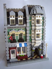
The interesting thing about going for half-size instead of just a generic "microscale", is that there's actually a scale factor involved to dictate what some parts should be. In both of these, you can see how 2x2 tiles on the sidewalk become 1x1 tiles to create the same mosaic-style patterns. A pair of skeleton legs on the grocer becomes one 1x1 tile with a clip on top. Doors and windows can be tricky, since LEGO hasn't made windows in some of these sizes. You're still required to fill some details in in an impressionistic manner, but not everyone can pull that off and still have things end up looking fairly accurate. | | Yes, we're sneaking in a double-header again - these are Tuesday and Wednesday's models of the day. |
|
Posted by
Dan
at
6:11 PM
| Name of Model: Gingerbread House |
| Created by: Parks and Wrecked Creations |
| Found at: https://www.flickr.com/photos/legoland-bill/15849719540/in/photostream/ , https://www.flickr.com/photos/legoland-bill/15850940389/in/photostream/ , and https://www.flickr.com/photos/legoland-bill/16036296492/in/photostream/ |
Details: 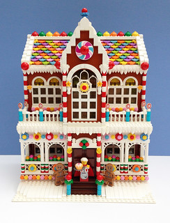 This beautiful gingerbread house is chock-full of an overwhelming amount of candy-coated details. It looks like the house is dark orange underneath the thick coat of candy, but that almost doesn't matter with all the other goodies packed in here. There's only three photos here, but they're clear enough to zoom in and get a good look. Some of the highlights: a mix of 1 x 1 and 1 x 2 plates with teeth to create icing-style cornice work, 2 x 2 tiles as Necco wafer-style roofing (I suppose they could be intended as a different candy, but it's definitely a great roof), swirl signal paddles on 1 x 1 round bricks and 1 x 1 round plates with open studs to decorate the railing posts, stacked 1 x 1 round bricks to make candy-cane lesenes, curved slopes for the icing snowbank, the standard 1 x 1 round plates as small candy trick, various reddish brown and dark brown tiles to make the chocolate bar door, and hypno disks and another printed 4 x 4 dish to represent swirl candies. Perhaps the best technique, though, is using trans-yellow bricks behind the windows to give the glass a sugary look when the building is lit up from the inside (visible in the second photo). This beautiful gingerbread house is chock-full of an overwhelming amount of candy-coated details. It looks like the house is dark orange underneath the thick coat of candy, but that almost doesn't matter with all the other goodies packed in here. There's only three photos here, but they're clear enough to zoom in and get a good look. Some of the highlights: a mix of 1 x 1 and 1 x 2 plates with teeth to create icing-style cornice work, 2 x 2 tiles as Necco wafer-style roofing (I suppose they could be intended as a different candy, but it's definitely a great roof), swirl signal paddles on 1 x 1 round bricks and 1 x 1 round plates with open studs to decorate the railing posts, stacked 1 x 1 round bricks to make candy-cane lesenes, curved slopes for the icing snowbank, the standard 1 x 1 round plates as small candy trick, various reddish brown and dark brown tiles to make the chocolate bar door, and hypno disks and another printed 4 x 4 dish to represent swirl candies. Perhaps the best technique, though, is using trans-yellow bricks behind the windows to give the glass a sugary look when the building is lit up from the inside (visible in the second photo).
There are even a few details here that are not immediately obvious in how they were built. Note how several flowers are sunken into the model so their stems don't pop out at you - these must be attached to something deeper inside the model. Then there are the 2 x 2 plates seemingly attached to fences - presumably there's a Technic axle behind those 1 x 1 plates connecting the 2 x 2 plates to something behind the fence.
Also perfect: the inclusion of Gingerbread Man collectible minifigures and Mrs. Claus from the Santa's Workshop set.
|
|
Posted by
Dan
at
10:31 AM
| Name of Model: Modular house created from parts in the 4954 | | Created by: misc2006 | | Found at: http://www.brickshelf.com/cgi-bin/gallery.cgi?f=273214 | Details:
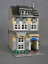 Now this is a great project that you can probably try at home - it's a beautiful modular house (similar to the Cafe Corner set) that was made as an original alternate model for the 4954 "Model Town House" kit (which, by the way, you can get free shipping on if you order through Amazon). The nice thing about little projects like this one is that you can easily determine if you have the parts or not - in fact, when I was little, the LEGO® club magazine (I think it was called Mania Magazine at the time) used to feature instructions for models that could be easily built from just one widely-available kit. Enough of the "marketing" type stuff though, truth be told this is also a very well-designed original house too. I love the architecture here, that upper balcony, the awnings for the door and windows (the ones on the top look like the part that goes over the car wheels in the main model!). There's even a flower bed and outdoor lighting here (creative ways of doing both of those, too). The bench in the back is a great use of studs-not-on-top parts in this scale, and there's even a proper staircase featured. I would have preferred some furniture (wasn't the original point of modular building to make it possible to show off furnishings?), but oh well. It's difficult enough to get things like that textured studs-not-on-top front to work well. Now this is a great project that you can probably try at home - it's a beautiful modular house (similar to the Cafe Corner set) that was made as an original alternate model for the 4954 "Model Town House" kit (which, by the way, you can get free shipping on if you order through Amazon). The nice thing about little projects like this one is that you can easily determine if you have the parts or not - in fact, when I was little, the LEGO® club magazine (I think it was called Mania Magazine at the time) used to feature instructions for models that could be easily built from just one widely-available kit. Enough of the "marketing" type stuff though, truth be told this is also a very well-designed original house too. I love the architecture here, that upper balcony, the awnings for the door and windows (the ones on the top look like the part that goes over the car wheels in the main model!). There's even a flower bed and outdoor lighting here (creative ways of doing both of those, too). The bench in the back is a great use of studs-not-on-top parts in this scale, and there's even a proper staircase featured. I would have preferred some furniture (wasn't the original point of modular building to make it possible to show off furnishings?), but oh well. It's difficult enough to get things like that textured studs-not-on-top front to work well. |
|
|
|



 and
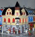
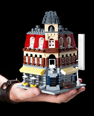
and  . Naturally, I love the little versions as well. These are at half the scale of the originals, fitting on 16 x 16 (or 5 inches square) baseplates instead of 32 x 32 (or 10 inches square). Considering how much has to be sacrificed due to size, it's amazing how many of the original techniques still work and how much of the original look still shows through.
 and
and  of
of