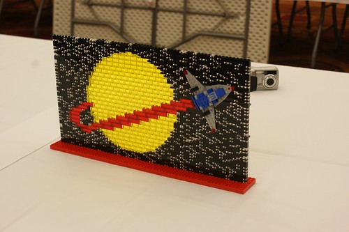
| Name of Model: Classic Space Mosaic |
| Created by yours truly, photo by: Joe Meno |
| Found at: http://www.flickr.com/photos/brickjournal/4586335406/in/photostream/ |
Details:  Earlier this year, I finished stocking up on transparent and translucent Pick-A-Brick elements well enough to actually build something. Noticing the large amount of trans-red and trans-yellow I'd amassed, I decided to build a mosaic of the LEGO Classic Space logo. LEGO used the classic logo for the space line from 1978 to 1989, but it also appears in some newer sets as an "easter egg" for fans of the original line. The transparent and translucent parts allow it to catch the light. I'm not entirely sure I'm happy with the design of the little ship I used here, but hey - it's LEGO, I can always change it. Earlier this year, I finished stocking up on transparent and translucent Pick-A-Brick elements well enough to actually build something. Noticing the large amount of trans-red and trans-yellow I'd amassed, I decided to build a mosaic of the LEGO Classic Space logo. LEGO used the classic logo for the space line from 1978 to 1989, but it also appears in some newer sets as an "easter egg" for fans of the original line. The transparent and translucent parts allow it to catch the light. I'm not entirely sure I'm happy with the design of the little ship I used here, but hey - it's LEGO, I can always change it.This model will be on display at BrickFair 2010. |
Saturday, July 31, 2010Translucent Classic Space Logo MosaicPosted by Dan at 4:51 PM |
Subscribe to:
Post Comments (Atom)


1 comment:
Nice work! I saw this at brickfair, it was even more impressive in person.
Post a Comment