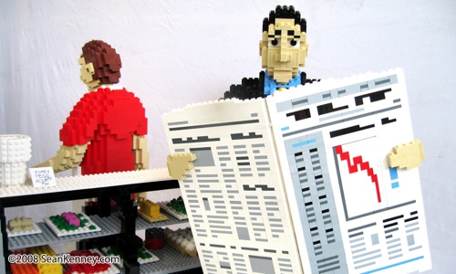
| Name of Model: Two short orders |
| Created by: Sean Kenney |
| Found at: http://www.seankenney.com/portfolio/two_short_orders/ |
Details: Sorry if this is a little too political or close to home, but I just had to cover these amazing sculptures. I'm not entirely sure what scale these are at, but they are amazing - the faces have all sorts of studs-not-on-top trickery in them to increase the resolution possible with the bricks, and the food counter and newspaper are fully detailed with more special parts. The egg carton is brilliant, and the newspaper just looks amazing - I have no idea how that weight is held up, but it looks like there's just hinges in there! The pictures speak for themselves, and my only gripe is that there aren't more of them. Sorry if this is a little too political or close to home, but I just had to cover these amazing sculptures. I'm not entirely sure what scale these are at, but they are amazing - the faces have all sorts of studs-not-on-top trickery in them to increase the resolution possible with the bricks, and the food counter and newspaper are fully detailed with more special parts. The egg carton is brilliant, and the newspaper just looks amazing - I have no idea how that weight is held up, but it looks like there's just hinges in there! The pictures speak for themselves, and my only gripe is that there aren't more of them. EDIT: Sean left a comment filling in some more details:
It looks like I overestimated how much was built sideways around the noses, but it's still a great effect. All those jumper plates must have thrown off my sense of proportions a bit - if you think of bricks as having a width:height ratio of 5:6, then sideways bricks have a ratio of 5:5, and a pair of plates have a ratio of 4:6. The jumper plates add in multiples of 2.5:2, which can be a bit harder to spot at first glance. If you're really good at these things (like all the LEGO-Certified Professionals are), you can make these odd measurements line up in all sorts of great ways. Those cheeks, for example, line up perfectly with the plates and tiles that are right side up. |
Wednesday, October 15, 2008Detailed Human Sculptures (for a Cafe-type Scene)Posted by Dan at 4:00 AM
Posted by
Dan
at
4:00 AM
Labels: certified professional, food, lego, sculpture |
Subscribe to:
Post Comments (Atom)


2 comments:
Hi! Thanks for featuring my creation -- I'm glad you like it. I just happened to catch this blog post by coincidence. :) To answer your questions:
The newspaper is supported solely by the hands... The hinges on the fingers hold it upright... But in the back, the paper leans inward a bit and touches the thumbs and palm, which support the bulk of the weight. (Just like reading a real paper!)
It's about 1:3 scale; The figures are just under 2 feet tall.
There isn't a lot of studs-not-on-top (SNOT) in their faces... mostly just jumper plates (1x2 plate with one stud) for half-stud offsets. I did use some SNOT for their nostrils (heh). In the case of the businessman, this necessitated building the cheeks sideways as well. The eyes are just 1x2 technic bricks with a 1x1 round plate. set into the hole.
The chart on the front of the newspaper looks like the stock market!
Post a Comment